A Pain in the Whatchamacallit
By Tiny Ruisch
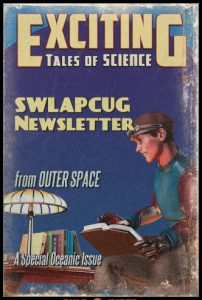
I know it looks a little grainy. I know it looks a little tacky. I know you probably said, “What the heck is Tiny doing now?” Yes, I’m talking about the front page of this months newsletter.
There are a lot of online sites for designing things. What is great about many of them is the fact that you don’t have to download and install software on your computer. Some have been discussed at club meetings. This month, I’d like to pass on a few that I use fairly often.
Create Word Clouds lets you make an image made of words that together resemble a cloudy shape. The size of a word shows how important it is e.g. how often it appears in a text. I’ve used it to create the heading image for “Big Words That You Will Probably Never Use” in the monthly newsletter. I’ve also made a “history” header which I occasionally use. It is easy to use. Just type in, or copy and paste, your words. Click “generate” and download your image.
˙ʞooqǝɔɐɟ uo sʇsod ǝʞɐɯ ı uǝɥʍ ʇoן ɐ bɹo˙ʇxǝʇdıןɟ ǝsn ı It is a fun little site that does only one thing. Whatever you type is converted to “upside down” text. Then just simply copy and paste to whatever medium you are using. The only minor quibble I have with the site is that it doesn’t retain capital letters.
If you need to make a logo, DesignEvo is a site with more that 10,000 templates that you can use to design it in a few minutes. Just pick a category, add a name and slogan (both optional), pick an icon and download your new logo. You also have the option to change the font.
One of mah favo’ite sites is Th’ Dialeckizer. This hyar site has a simple corncepp. Type o’ past whutevah yer hankerin’ t’say into th’ text box. Then seleck a dialeck fum sevahal catego’ies: Redneck, Jive, Cockney, Elmer Fudd, Swedish Chef, Mo’on, Pig Latin, Hacker o’ Censo’. Yo’ kin also inter a URL address an’ translate an intire web page. Redneck is th’ dialeck ah use most offen.
Almost all of the buttons and information tabs on the club’s web site were made on ImageFu.com. Like all the links in this article, it is free and easy to use. There are several options for text, coloring and shape. After you’ve finished your design, click the “download” button. Da Button Factory is another site that does the same thing.
I got the idea for this article after I stumbled across The Pulp‑O‑Mizer web site. Although, the obvious purpose is to sell merchandise, I immediately thought it would be fun to do something for the club newsletter. I designed the cover page in less than fifteen minutes without having to look at any instructions. The reason it doesn’t look so great is because I expanded it to fit the page. It wasn’t the best resolution. You can see that it looks a lot better in the picture accompanying this article. I probably won’t use this site again.

That’s all for this month. Thanks for reading.